The creation of a neutral nursery isn’t always as easy as it first seems. The simple colour palette can quickly become boring or cold. The whites not quite working together. The texture not exactly pulling it all together as you had hoped. But with research and patience the vision can come to life – and when it does it can be spectacular!
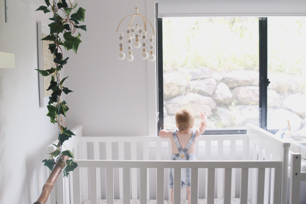
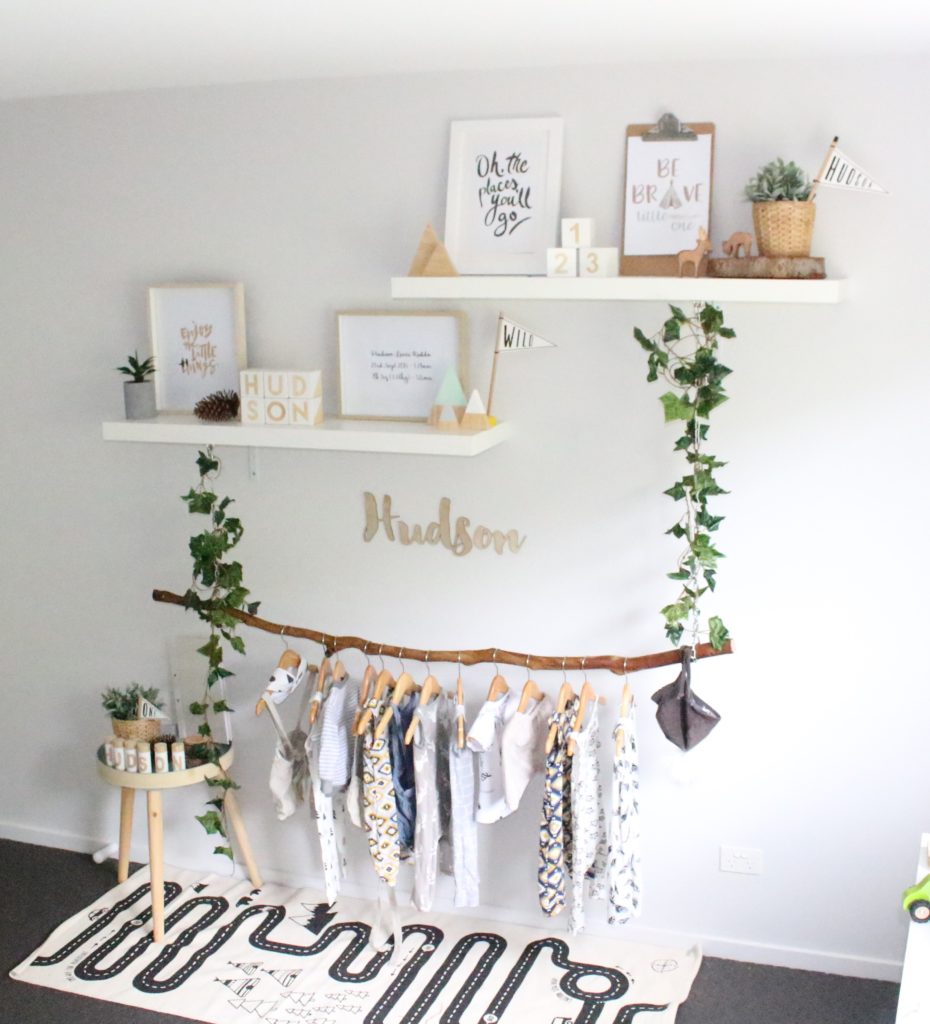
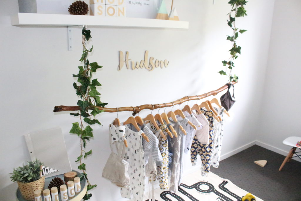
Hudson’s nursery is a beautiful example of nailing this neutral brief. Designed and styled by his mother Amy Rodda, this space is bought to life by the natural elements of plants and the stunning hanging branch feature. The consistent colour palette is perfectly executed with accessories that bring endless warmth and interest.
We were delighted to catch up with Amy on her inspiration and goals for creating this calming canvas for her son to grow up in.
 TELL US ABOUT THE OWNER OF THIS ROOM?
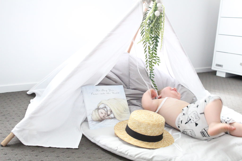
‘Hudson is just about to turn 2 (in September) he loves to play, use his imagination and of course destroy his room once Mum has tidied it up. He is a cheeky, happy, loving and adventurous boy who is obsessed with bikes, balls, cars and trains. He loves hiding from Mum and Dad in his tepee as well as reading his favourite book “Hairy Maclary” in there.’
WHAT WAS THE BRIEF FOR THIS ROOM?
‘In the beginning, Hudson’s room was a blank palette. We were unsure of the gender of our baby and wanted to wait until he/she arrived before we did too much. Once we found out he was a boy, I started researching and found lots of inspiration from Pinterest and Instagram. I wanted to stay neutral and add element of nature into the room with the hanging branch and vines. The room needed to be modern but also fun and playful. I constantly find myself adding new things, but staying with the whites, greys and timber elements.’
‘A lot of my inspiration comes from things and people I follow on Instagram as well as Minty Magazine. There are some amazing accounts out there with some beautiful baby rooms and nurseries. I have found most of my inspiration comes from Sophie Vine’s little boys rooms as well as Theo from @charlotteandtheo.’
HOW DID YOU SELECT YOUR COLOUR PALETTE?
‘I just stuck with neutrals as I knew I could chop and change things more easily when I wanted to (and I have done this more than once).’
WHAT IS YOUR FAVOURITE FEATURE IN THE ROOM AND WHY?
‘My favourite feature would be Hudson’s hanging branch, I love that is a beautiful feature but it is also practical and the fact that I (with a little help from my husband) made it.’
 WHAT WAS THE BIGGEST CHALLENGE?
‘Probably making the tree branch hanger (haha). Also not going crazy and wanting to buy every single thing to put in his room. Ensuring it stays functional but also a play space for Hudson.’
WHAT IS YOUR OVERALL FAVOURITE THING ABOUT THIS SPACE?
‘I love that this is a room for my son (and future children) to learn, play and grow in. It’s a space that as he grows will grow with him.’
Birthday Board by Zilvi
Wooden Pull Along Bear by Wiggles Piggles
Hudson Mobile by Willow Soy
Wild Flag by This Paper Book
Hudson Letterpillars by Official WhoisQ?
Tepee by Fox and Wilder
Hudson Round Mat by Jhett and Co
Donut Stacker by Timberland Toy Co
Wooden Baby Book by Hyde and Seek
Car Mat by Oyoy
Hudson Wooden Plaque by Little Wild Oak
AMY’S TOP 3 INSTAGRAM ACCOUNTS TO FOLLOW:-
@sophie.vine
@charlotteandtheo
@thesimplefolk
Photo Credit: Brittany Lewis
IF YOU WOULD LIKE YOUR ROOM FEATURED AS A MINTY REAL ROOM TOUR PLEASE GET IN TOUCH HERE

